Five ways to entice readers with your digital magazine
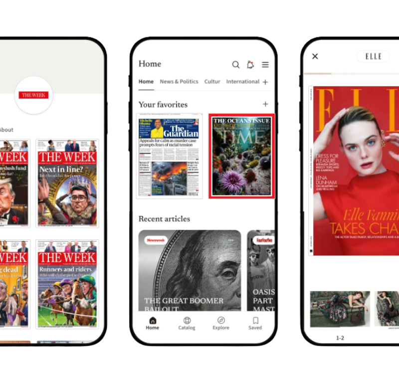
At the Mequoda Group, we prefer vertical reflow because of the superior reader experience it delivers; older readers and even younger readers can have trouble reading content that’s squeezed down from magazine size to tablet size (as is done with a digital replica edition) if you don’t reflow your content.
And the growing popularity of vertical reflow raises the question of what to put on that first screen.
I’m focusing on designing for the iPad since that is the most popular tablet, and iPad users make up the majority of app magazine buyers. When you employ vertical reflow, you don’t have to worry about responsive design, because the content’s already laid out to be easily viewed on that iPad screen.
And just as in the newspaper days when editors chose content to go above the fold that would keep their readers engaged and coming back every day, iPad content designers have to consider how to do the same. You don’t want your subscribers or single-issue buyers yawning and scrolling straight through your magazine.
Those readers won’t be renewing, or buying a subscription, if they’re not captivated by your content in the first few seconds on each page. And it’s certainly a waste of resources if you’re spending time and money to reflow your content without taking reader engagement into consideration.
So how to get readers’ attention and keep it? At the moment, there are several different design options popping up out there.
Discover digital publishing tips for creating digital magazines in a tablet magazine publishing world when you download Meduoda’s FREE Digital Magazine Publishing handbook today.
1. Use an oversized, provocative headline
While this seems to be declining in popularity, there are still plenty of cases where this technique is used. For example, New York magazine, one of our tablet favourites, did it for almost every feature it published in 2013. Now it’s a bit harder to find, but apparently the designers thought that screaming “FREDDY LIVES!” as the title to an article on horror movies would be even more provocative than a graphic image from said movie.

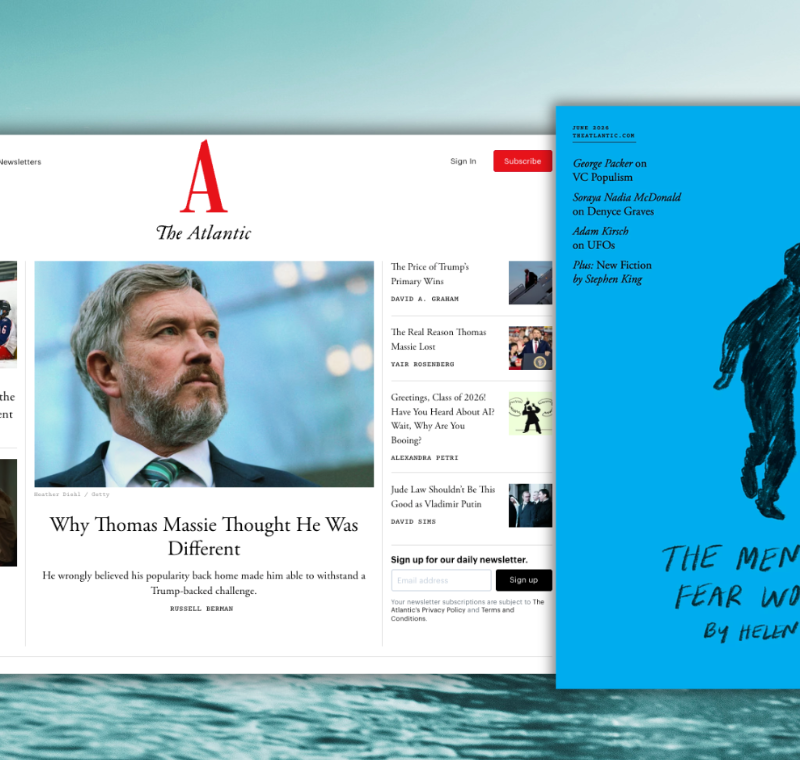
2. Feature a compelling image
Again, fairly common. The right image can really have an impact on a reader casually scrolling through a digital magazine. In practice, an image completely alone looks like an ad, so all of the designs with prominent images I found have at least a small headline included to indicate that it’s editorial content. American History’s art director knows that having someone looking directly out of the page at the reader is absolutely arresting. (In an interesting enhancement, Popular Science lets you double-tap the screen to make the headline and any text disappear, and enjoy the lead image all by itself.)

3. Start with an engaging video
And speaking of our friends at Popular Science, here they are opening an article with a rather breath-taking view from the back of a high-speed train in an artist’s rendering video. See the motion at the top of the screen, as the train passes under a bridge?

This is a technological offering that Mag+, was excited about long before most publishers had adopted it. Now, however, it’s becoming almost common. “Layering” allows the designer to feature a stationary image and have the corresponding text be scrollable. Mequoda client I Like Crochet offers the directions for each project as moveable text that allows the reader to keep the all-important image of the finished product in front of her all the time.

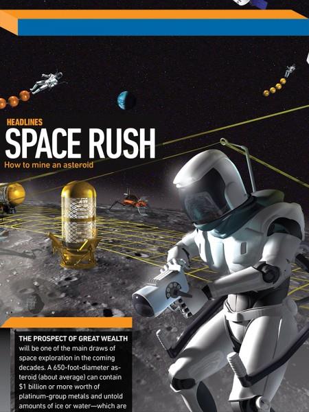
Here Popular Science combines a compelling image, startling headline (How to mine an asteroid!!!) and scrollable text. (We shouldn’t have to refer to PopSci so often in a post like this, but they are pioneering many of the emerging best practices in the tablet app magazine space.) Of course designers being designers, we may soon see other “above the fold” offerings that I haven’t seen yet or even thought of. That’s the beautiful thing about tablet app magazine publishing!
This article is based on a post by Ed Coburn from Mequoda Daily. Used with permission. All rights reserved.
We recently launched the new FIPP.com (in beta, while doing live testing and refinements). The relaunch is not only about look and feel, but even more so about us providing a platform to further enable the sharing of ideas, insights and opinions within our global network. If you have a story to tell, or are interested in contributing to FIPP.com on a regular basis, get in touch with our communications manager, Amy Duffin.