Have you discovered the power of infographics yet?
[Sponsored] Infographics have become hugely popular in the media and beyond, providing a refreshing alternative to standard and often boring bar and pie charts. Using a variety of graphic elements and images, an infographic visually represents key information and makes your data more memorable and easily digestible.
Reasons to create an infographic
You’ve run your survey and have lots of interesting data which you now need to report on. Have you considered creating an infographic? You may think, ‘I’m not sure where to begin and it looks time consuming’ but have you thought of the benefits?
Infographics will grab your readers’ attention as they are highly visual and easy to extract headline trends from. The saying goes ‘a good infographic is worth a thousand words’ and we couldn’t agree more. In this age of over-worked executives and general information overload, grabbing the attention of your target audience with short, sharp facts is key.
Infographics allow you to use a combination of visuals, text and data that will have far more impact than a set of statistics presented as text or graphs. For an international audience it has the added benefits of portraying data in a less text-heavy format, thereby minimising any language issues.
Infographics can also be shared easily, which is useful if your aim is to get as much PR from your survey results as possible. Even the most mundane data can be made appealing with an eye-catching infographic and reach far beyond your initial audience if it goes viral.
How do I create an infographic?
Plan what you want to include carefully. There’s a limit to how much of your data can be included without overwhelming the reader and making the infographic too busy. This filtering process will encourage you to prioritise your key messages.
Think about which layout will work best for your data theme (see types of infographics below). You can also try typing in ‘infographics’ into a search engine to get some inspiration from examples already out there.
Once you have a rough idea of what to include and how to lay it out, you need to pick a tool to use. There are a number of free infographic creation tools available on the web such as easel.ly, pictochart.com and info.gram so have a look around and see which one suits you best. You can either use one of the template designs provided or create a brand new design. It doesn’t take long to learn the ropes and you will have created your first infographic before you know it.
Types of infographics
There are various styles of infographic, which normally fall into one of the following 6 types:
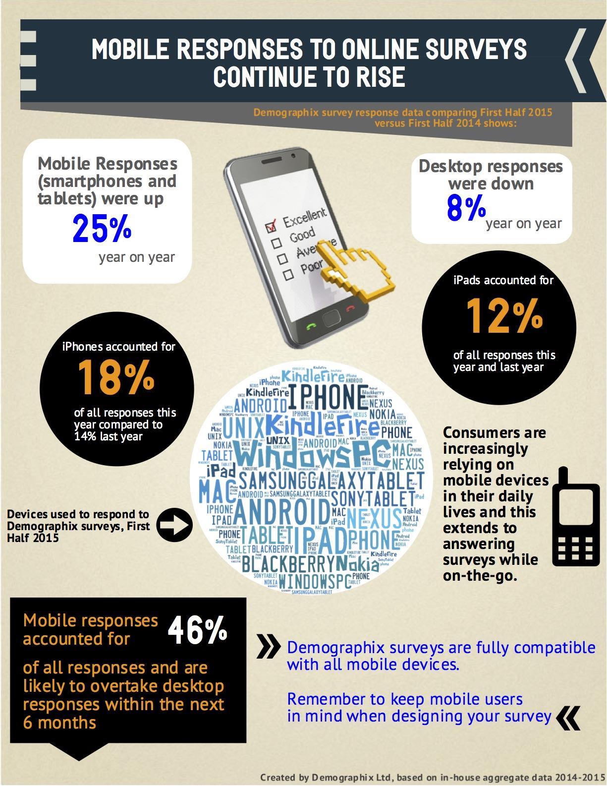
1. Data visualisation i.e. communicating data through charts, graphs and design. This is probably the most common type and enables you to use a variety of ways to display data. The example we give shows how survey responses to online surveys is dramatically moving from desktops to mobile devices.
2. One versus another comparison. If you are comparing any two items (e.g. brands or countries), you can split your infographic in half to highlight the differences. You can compare more than two items, but beware of space constraints.
3. A list of items. Listing a number of key points can lend itself well to infographics, as our example below shows. It is much more easily digestible than a bullet-point list!

4. A flowchart. This type of infographic offers a summary of a process that leads to various outcomes.
5. A timeline. This can work well when you are showing how something has changed over time e.g. if you have done some trend or longitudinal research and there are some key changes along the way.
6. Maps. These are useful for highlighting regional differences, whether on a global scale or more locally. Regional data of respondents is often a standard demographic question in a survey, and can easily be analysed to uncover compelling geographical variations.
Top tips for Creating an Infographic
• Keep it simple. No doubt you would love to share all your survey results, but for this purpose, focus only on the crucial and most interesting points which will engage your audience.
• Use consistent styles, fonts and colour schemes. An infographic should have a visual style that does not detract from the message by being too fussy or chaotic.
• Make sure your infographic can be read at a glance by telling the story visually. Not every little detail needs to be communicated instantly, but the overall gist of the data should be clear in a few seconds.
• Explore different visual options. Try to avoid standard bar charts, line graphs or pie charts or at least make your charts more visually appealing by adding images or logos to them.
• Using applicable metaphors can be a great way to engage readers e.g. ‘The Road to Success’ where an image of a road is used as the main image.
So what are you waiting for? Get your creative juices flowing and create your very own fabulous infographic which gets your audience talking and has the chance to go viral.
This article is sponsored content by Demographix.
More like this
Must-see infographic: What really fosters innovation
Infographic: 7 metrics prove digital publishing is thriving
Technology drives innovative era for magazine media research and measurement