Why data visualisation of social analytics is the next frontier for publishers
Visualisation can be used in various ways, not just for communication, but also for data exploration, according to Alberto Cairo, Knight Chair in Visual Journalism at the University of Miami’s School of Communication. “There is an insight you can only get if you map the data. If you represent the data numerically or tabularly, you will not be able to see those kinds of things.”
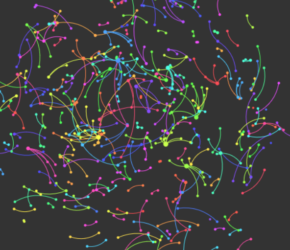
Above: Jessica’s Netlytic experiment capturing social conversations on Twitter using the keyword ‘magazine’. Data (approx. 10,000 tweets) captured over an hour or two. Visualisation of name network shows all of the conversations about ‘magazine’.
Data visualisation can be used in any realm that requires the exploration and the understanding of large amounts of data, Cairo said. “Because, we evolved to be visual creatures. A huge portion of our brains are devoted to the processing of visual information, not to the processing of textual information. So, when we are presented with visual information, our brain immediately begins trying to detect patterns and trends in what we are seeing.
However, when numbers are transformed into visual properties, like height or length, or position on an axis, our brains begin to understand data better, he says. “The only way you can understand a complex data set is by representing it visually. Once you’re presented with it visually, your brain identifies trends and patterns in the data, which is the first step towards understanding what the data means. Its basically visual exploration.”
Visualisation can include data maps, diagrams, statistical charts, among other things. Visual displays of information let readers see beyond what the bare eye can perceive, transforming tweets, posts, likes, shares – reader engagement – into stories that can be not only shared with a company’s digital team, but also with advertisers.
Tools to chart the analytics of social networks include Google Fusion Tables, Tableau, Power BI, R, Quadrigram, CartoDB and Netlytic.
And, according to Cairo, the tools are easier to use than ever, but they still have a learning curve. “You still need to learn how to use them,” he said. “And the other thing, you need to analyse the data first, or at least be able to manipulate your data to visualise it. Sometimes you visualise it to understand it, to discover what the patterns and trends in the data are.”
So, if we’re wired to look for trends and patterns, what can visualisation of social analytics tell us about audiences? For magazine publishers, one of the challenges of the digital reality is that audiences come to them across platforms.
Visualisation tools can help publishers better understand their audiences and enable them to influence editorial strategy and create targeted opportunities for advertisers. By visualising social analytics data, publishers can extract deeper insight into their audiences on various social platforms and could start building visualisations into strategic decisions.

Above: Allure magazine’s social engagement, via Twitter, visualised in personal name network with Netlytic.
Visualisation tools include Netlytic, a powerful cloud-based social network analyser that allows users to summarise large amounts of text, mine for data and keywords, and visualise engagement. Netlytic is also useful in that it not only captures thousands of records in real time, but it also condenses and analyses it in a way that is easier to understand.
It was created by Dr. Anatoliy Gruzd, Canada Research Chair in Social Media Data Stewardship and an associate professor at Ryerson University in Toronto. Visualisations, says Gruzd, allows our brains to find patterns and outliers in the data. And, they’ve become increasingly important to make sense of big data.
As an increasing number of audience members come to magazine through social media, tools like Netlytic would be critical for publishers because it is able to show who these individuals are, what they’re engaging about, what topics they’re interested in, and how they’re feeling about it. “The information would be very useful to them, to adjust and refine, to decide what content to feature and what not,” Gruzd says.
“Essentially, tools like Netlytic will help publishers fine tune their outreach and marketing strategies to attract a wider audience and understand their current audience. But also, something that is also very important, to show business partners and advertisers the effectiveness of their web presence and social media presences.”
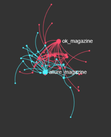
Above: OK! magazine’s social engagement via Twitter, visualised with Netlytic. This is one moment in time, one cluster of social interactions, based on who replies to whom or who mentioned whom.
Visualising social data with Netlytic allows publishers to see the most prominent discussions around a topic, whether that is a marketing campaign, a hashtag, a brand or keyword. It is useful for determining moods or themes of Twitterati, (or other social network users). It is able to highlight “influencers” or “brand ambassadors,” who are interacting with content or engaging with the brand.
“Data analytics might also be able to help publishers identify potential readers who are not necessarily talking about their stories at the moment, but who might be interested in their content.”
Gruzd points out that web analytics and web data identifies people who’ve already found your brand.
“But, how do you go about finding people who might be interested in your content and try to engage them, try to connect with them, so they pay attention to you? That’s when you have to go into the wild.”
And by wild, Gruzd means social discussions and platforms that media brands don’t control. He outlines steps to success: finding the relevant audience, running social campaigns, measuring and tracking these campaigns via social analytics programs to identify individuals, and then looking deeper at analytics traffic, to see how they came to your website and how long they spent there.
More like this
Graphiq targets publishers with new data visualisation tools
A match made in heaven – data, content, and the transaction marketplace